– ux/ui designer
Absa Banking App Registration & Log In (2015 – 2017)

CHALLENGES
Absa bank is one of the major banks in South Africa. The team had to build a new experience based on legacy banking systems that were not going to change as fast as we needed to design and build.
The old app was planned for decommission and we had 6 months to get the new, simpler app out to the market. We worked in a lean production cycle and iterated rapidly every two weeks, pushing out a new feature every month.
TEAM
- 1 UX Designer (me)
- 2 UI Designers (iOS/Android)
- Design Lead
- Systems Service Analyst
- Product Owner
- Scrum Master
- Stakeholders: Head of Banking Transactions, VP in charge of Online Security
Out With the Old – In With the New!
The bank was scrapping the old, ugly banking app that was slow, buggy, and had a terrible interaction experience. Our team was building the user experience from the ground up.
Working with the systems analyst, we determined the calls and basic functions the system required for a customer to register a new account and login. I went about building out the user flows and wireframes for each of the flows, and then presented these to the product team each week. The whole team consisted of a large engineering team based in various locations around the globe and the co-located team in Johannesburg – I presented the concepts each week to the whole team for feedback, which we used to correct incongruent ideas and then iterate.

Make It Easy!
Along with the old systems, we were required to keep the existing legacy login process, which was cumbersome and confusing. We investigated the process through numerous usability test sessions and it was clear that we needed to make it easier.
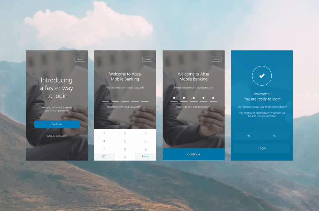
Fortunately, there was already an idea for making it slightly better – allowing the customer to create an app passcode after the initial secure login.
I went about analyzing the systems architectural process document so that I completed understood the technical requirements. Once I had the initial flow and running the wireframes past the team, I created a prototype for usability testing.

IT’S BIG
The biggest challenge with this feature, was that there were so many steps to register and eventually login, and customers were consistently locking themselves out of the app. Although we couldn’t fix the main problem which was routed in the legacy banking systems, we did go about making it seem easier to register and log in.
We created a better register and login experience by making things clear each step of the way; using less technical “banky” terminology, and being a little more colloquial in our writing. We wanted to reassure our customers that it was secure and safe to register and use the app, but also that we’re human.

