– ux/ui designer
Case Studies
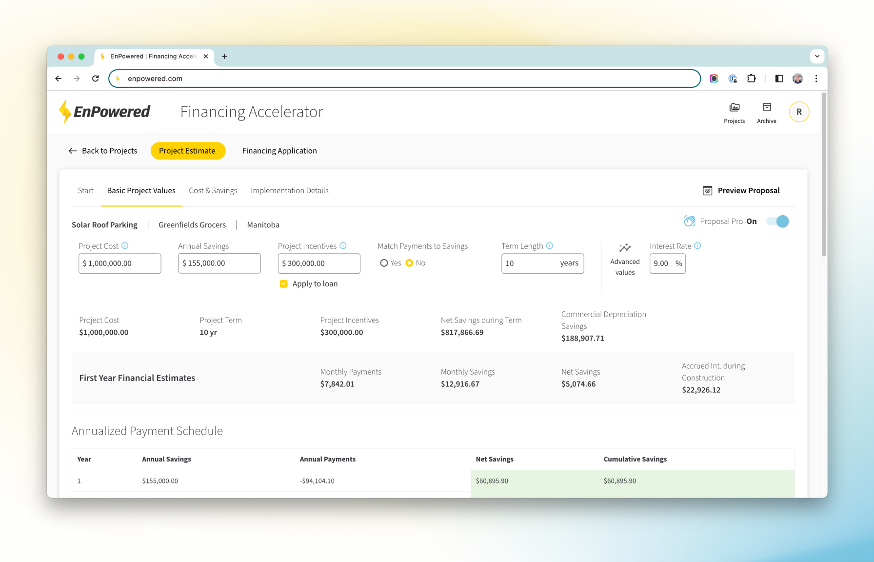
Enhanced Clean Energy Financing Experience
PROBLEM STATEMENT:
In the world of clean energy, EnPowered’s partners encountered a major challenge – they couldn’t easily formulate the best financing options for their customers. The problem was the complex nature of financing models and the need for specialized knowledge. This complexity made it tough to find the ideal financing structures that would truly benefit our customers.
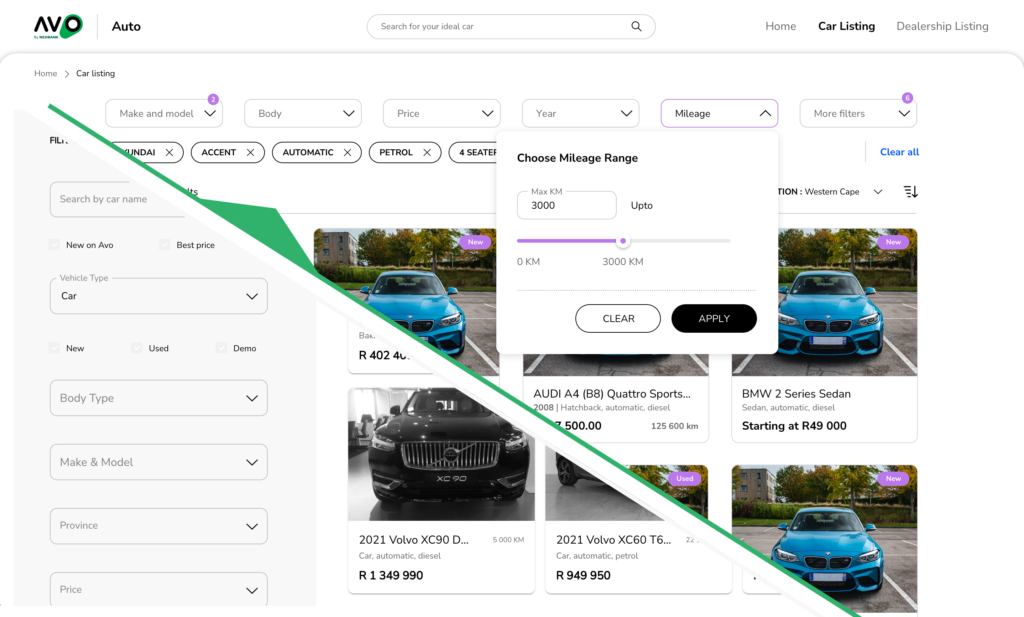
Avo Auto Search Filter
PROBLEM STATEMENT:
South Africans looking online for pre-owned vehicles, only trust a few vehicle listing platforms and consider them as the “go to” sites.
Avo Auto’s challenge is that they are competing with those offering much of the same features. In order to differentiate themselves and to compete with sites that have large and varied lists of vehicles, Avo Auto needed to emphasise their USP.

Nedbank Live Chat & AI Chat Bot Integration
PROBLEM STATEMENT:
Nedbank clients want quick answers or solutions to resolve their banking problems in their time and in a way that suits them.
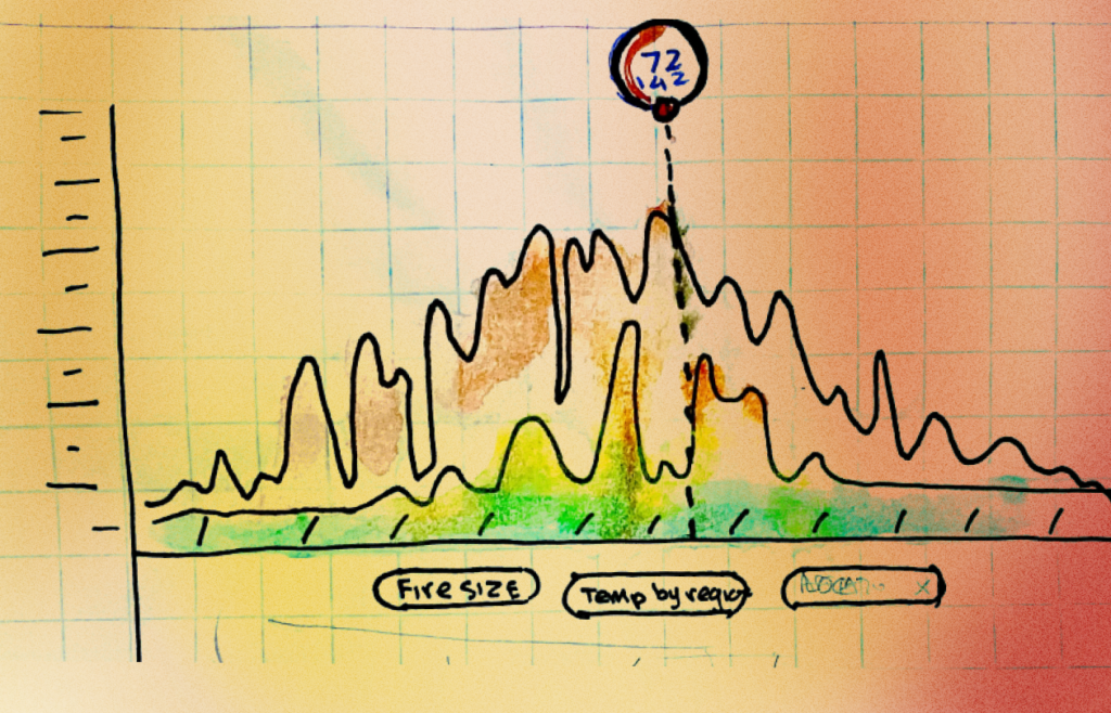
Design Challenge: BC Forest Fire Prediction
Challenge:
In 2021, I accepted a design challenge to design a small feature of a system that helps specialists in British Columbia, Canada, predict where forest fires frequently occur accompanied by how often they occur over a specified period, and Allow forecasters to easily view and interpret data of the history of forest fires.
Nedbank Digital Customer Journey
PROBLEM STATEMENT:
Many Nedbank customers struggle to access the banking app and need intensive assistance to verify themselves on the app or when creating an account. There is no one particular, consistent way to verify, activate a digital profiles, and begin banking on the app or online. This causes customers extreme frustration and they have to take time to visit the nearest branch to resolve.

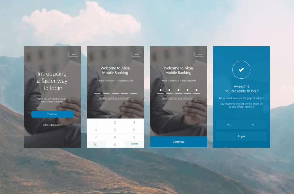
Improve Log In – Absa App
PROBLEM:
Improve the current login layout was in order to scale for the next iteration of adding multiple users and other pre-login features, including a UI update to reflect the move branding from Barclays, back to Absa. The layout needed to be optimised without adding too much complexity.
TIMELINE:
1 Week
TEAM & MY ROLE:
• UX Designer (me)
• 2 UI Designers
CHALLENGE:
How might we best utilise the space given that the primary action here is to log into the app?
The existing login screen was only able to have a limited amount of content. Although keeping content on this screen to a minimum was the goal, we needed to add the options for adding multiple users, legal and compliance information and also make provision for other “pre-login” features.
Screen estate was taken up mostly by the keyboard and a big button for fingerprint login (if the phone had fingerprint scanning capability).


Absa Prepaid Electricity on App
TEAM & MY ROLE:
• UX Designer (me)
• Two UI Designers
• Systems Analyst
CHALLENGE:
Stakeholders briefed in that we were to add a feature to allow the purchase of “pre-paid electricity” to our customers. The traditional process included visiting the local convenience store to pay cash for an electricity “token” that a specific amount which they then entered on the keypad of their prepaid electricity meter at home.
We needed to provide a consistent experience for all prepaid electricity customers while maintaining good design principles, and adhering to the regulatory requirements mandated by the different municipalities.
Added requirements:
In order for the feature to be sustainable and provide value in the long-term, the system needed a way to store a specific meter number allowing a better experience on subsequent purchases.
I hypothesised that in some cases the customer would not always be home when purchasing electricity. I designed a prepaid history section allowing the customer to retrieve the electricity token they purchased earlier.
Once the purchase is successful, the system returned a lot of information on the “receipt” which would not be easily understood by most customers and also gave them information that was not necessary to display upfront. To improve the experience, I reorganised the information hierarchy which allowed the customer to see the token information, kWh they received for the amount that they paid, at the beginning of the receipt rather than at the end as this is how it originally returned.
We had an extra complication we had to cater for — each municipality had many different requirements of what information needed to be returned on a successful purchased. I worked with our engineers in creating a template that would “look” for the important information from the receipt and display it according to what we identified as being important to see first.
OUTCOMES:
I took a highly complex technical design and crafted a concise simple flow that would not overwhelm the customer.
We managed multiple error states, despite the technical errors and challenges encountered due to the bank systems communicating with a third-party system. Through analytics and successful purchase data, we discovered that customers usage increased substantial after launch before any type of commercialisation efforts.

Virtual Assistant Flight Booking Concept – Nedbank
PROBLEM:
We needed to understand the pain-points when a client books a flight though a virtual assistant chat platform.
OBJECTIVE:
Improve the UX and the interaction of the client with the virtual assistant over a chat platform.
This scenario is one example of the thousands of possible requests that could come through the lifestyle chat platform.
I illustrated the possible experience with a simple journey map to foster a discussion in discovering possible problems to solve
We found that there were a few possible challenges for the client caused by long waiting times and the effort of type out all the required information in a chat format. Granted the next time booking a flight over chat might be easier as they would then have all your information, but initially it is tedious.
Conclusion:
Some thoughts from the exercise; in some situations it would be easier to use a booking app or website to plan your next flight, however, if you are a person who is familiar with being assisted by a virtual assistant or “digital concierge”, this process is acceptable. However, a majority of our client base would not find a concierge necessary as their lives are not as busy as most executives or business people whose lives are filled to the brim with meetings and work.
Absa App Registration and Log In
CHALLENGES
Absa bank is one of the major banks in South Africa. The team had to build a new experience based on legacy banking systems that were not going to change as fast as we needed to design and build.
The old app was planned for decommission and we had 6 months to get the new, simpler app out to the market.
Design Archive
Over the past 20-something years, I’ve worked on numerous projects which include UX and UI designs for websites, logos, and small graphic design projects.

I’m in the Dark!
Micro Interaction
During one of our Absa app design workshops, we discussed the situations that users are in when they need electricity, and it is usually when the the electricity is almost run out or, when they are in the dark, at night, needing to make dinner.
We decided to add a seemingly novel feature to the the final success screen where the token numbers are displayed.
An on/off torch switch. A user can use their phone torch to see the keypad of their meter if they’re in the dark. 🤓

Accenture Mobile Web Design Retro-Fit
PROJECT: (2014) Accenture SharePoint Site Responsive Mobile Design
OBJECTIVE:
Design and retro-fit Accenture SharePoint internal marketing group sites to be responsive on a mobile phone.
TIMELINE:
2 Months (for the initial project)
TEAM & MY ROLE:
Project Manager/Web Designer (me)
UI Designer
CHALLENGE
The version of SharePoint sites being used by Accenture for internal marketing and news was not responsive on mobile devices, and the native “mobile” rendering plugins did a poor job at allowing Accenture staff to effectively access the sites on their mobile devce browsers. The system allowed the adding of customer CSS and JavaScript plugins. The challenge was converting the menu and content structure from tables to responsive elements and even converting the table menu to a slide-out menu.
My ability to customise our Accenture client’s internal marketing site to a “mobile friendly” website, by retro-fitting the SharePoint design and adding custom CSS and javascript, allowed us to take on new projects that had not been previously considered.
Once the initial CSS code and media queries was set up, we were free to work within the Accenture brand guidelines and push the boundaries to create good looking usable SharePoint sites.