– ux/ui designer
Enhanced Clean Energy Financing Experience

Introduction
In the world of clean energy, EnPowered’s partners encountered a major challenge – they couldn’t easily figure out the best financing options for their customers. The problem was the complex nature of financing models and the need for specialized knowledge. This complexity made it tough to find the ideal financing structures that would truly benefit our customers. On top of that, the ever-changing lending landscape added another layer of difficulty in figuring out what realistic financing terms should look like.
Problem Overview
EnPower’s hardware partners invest substantial time and resources in collecting documents from customers for financing applications, and face numerous challenges. From delays in document submission to receiving incorrect information, the process involves multiple touchpoints, potentially justifying the need for a dedicated employee. The partner journey reveals distinct challenges in understanding, communicating, and collecting required documents, leading to a prolonged follow-up pain loop.
Design Challenge
Designing a user experience that caters to the intricate needs of partners and customers in the clean energy sector presents a unique challenge, particularly in the realm of project financing. This case study delves into the development of a comprehensive solution aimed at simplifying the financing process for EnPowered’s partners, enabling them to efficiently secure financing for their customers’ projects.
Initial Solutions
To cater to these problems, EnPowered team developed a solution in the form of a dynamic online spreadsheet to enable partners to immediately get estimates for projects when using financing for their customers, expose them to the several ways they can structure a deal, and meet the customers’ requirements.
Partners were given a link to a Google Sheet that – essentially a financing calculator, enabling them to immediately get estimates for projects that needed financing. It also had the ability to generate a pdf file.

Initial layouts for the PDF proposals were made by the devs, but then I jumped in and started to iterate on a cleaner look along with a better flow of information and visual hierarchy.
Iteration 1

Iteration 2

Iteration 3

User feedback and Analytics Drive Improvements
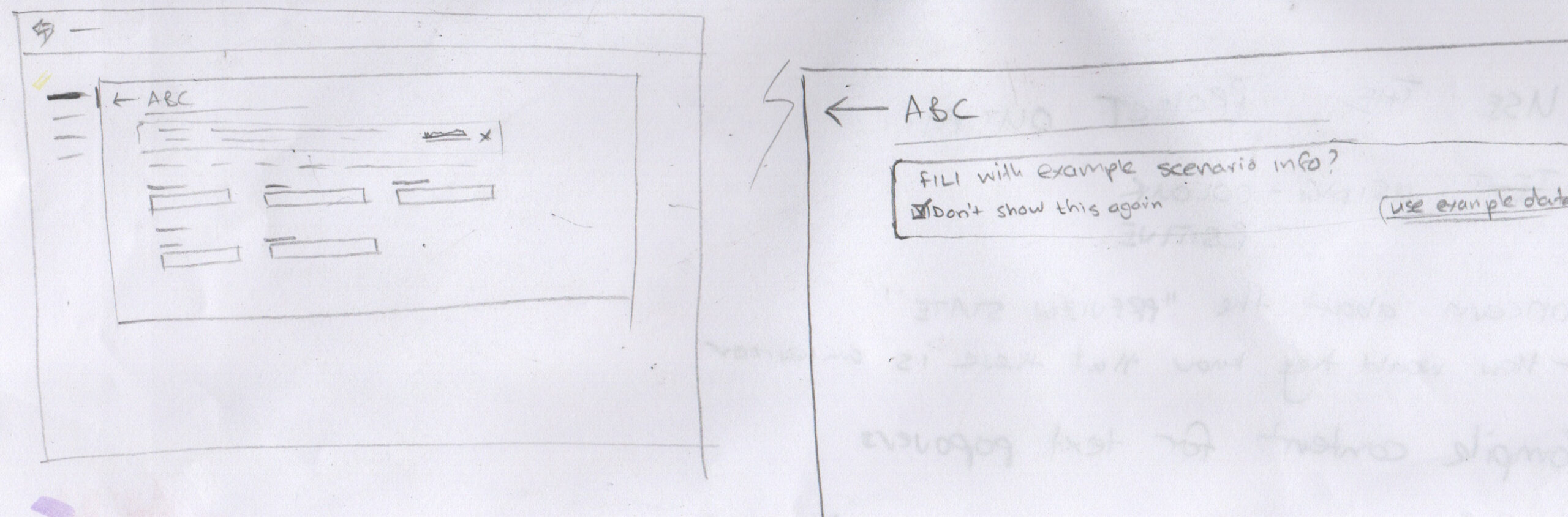
Having the calculator available in the form of an online spreadsheet was valuable to start, as we were able to gauge if the service we offered would be useful to the partners, however, this was not a sustainable solution. It required a new sheet to be created for every new project proposal and there was the risk of a person deleting parts of the sheet containing the formulas therefore rendering the calculator useless.
The product team went through quick iterative cycles to find new solutions, a new solution dubbed, “Proposal Request Form”, was created using Typeform in a “wizard” step-by-step format. This allowed partners to enter information quickly, such as, basic project details, costs, savings and others amounts. After viewing a summary, the system would email them a copy of the proposal with the relevant savings and estimated payment schedule if the project was financed.

We had positive feedback from partners after calls with them, and received valuable insights from their using the form. We used the qualitative anecdotes and usage data to inform the next iteration of the proposal generator.
We soon learned of the limitations of using the third-party platform, as there was no easy way to adjust interest amounts, cater for depreciation, and many other factors. The product team kicked into gear to start building an in-house cloud-based solution.
A New Proposal Wizard
We set out to “redesign” the wizard in a similar fashion to the Typeform version, except this time we had more control over the branding and the back-end.
Again, we implemented a streamlined process that began with a wizard-type form.
Partners could input basic project details and upon form completion, they could select a name from a dropdown list of representatives, ensuring the generated proposal is emailed directly to them, with the account executive (AE) automatically CC’d to maintain communication transparency. Each new project initiated through this form is automatically registered in our Customer Relationship Management (CRM) system, enhancing deal visibility and tracking. Additionally, we’ve integrated an internal-facing form accessible by ops and sales teams, designed to be partner agnostic.
I moved right into UI design. I incorporated the new branding and started working in parallel on a new design system that would be used for the future iterations of the product.
Here are a few of the final screen designs of the proposal wizard:


Announcing: the Financing Accelerator!
In order to provide value to our partners, and in turn, their customers, we needed to move quickly to deploy new iterations of the proposal generator. As more requirements came in, based on regular feedback from users and the funder ops team, we realized that the current simple step-by-step wizard format did not allow us to scale the functionality.
Design Process: Ideation
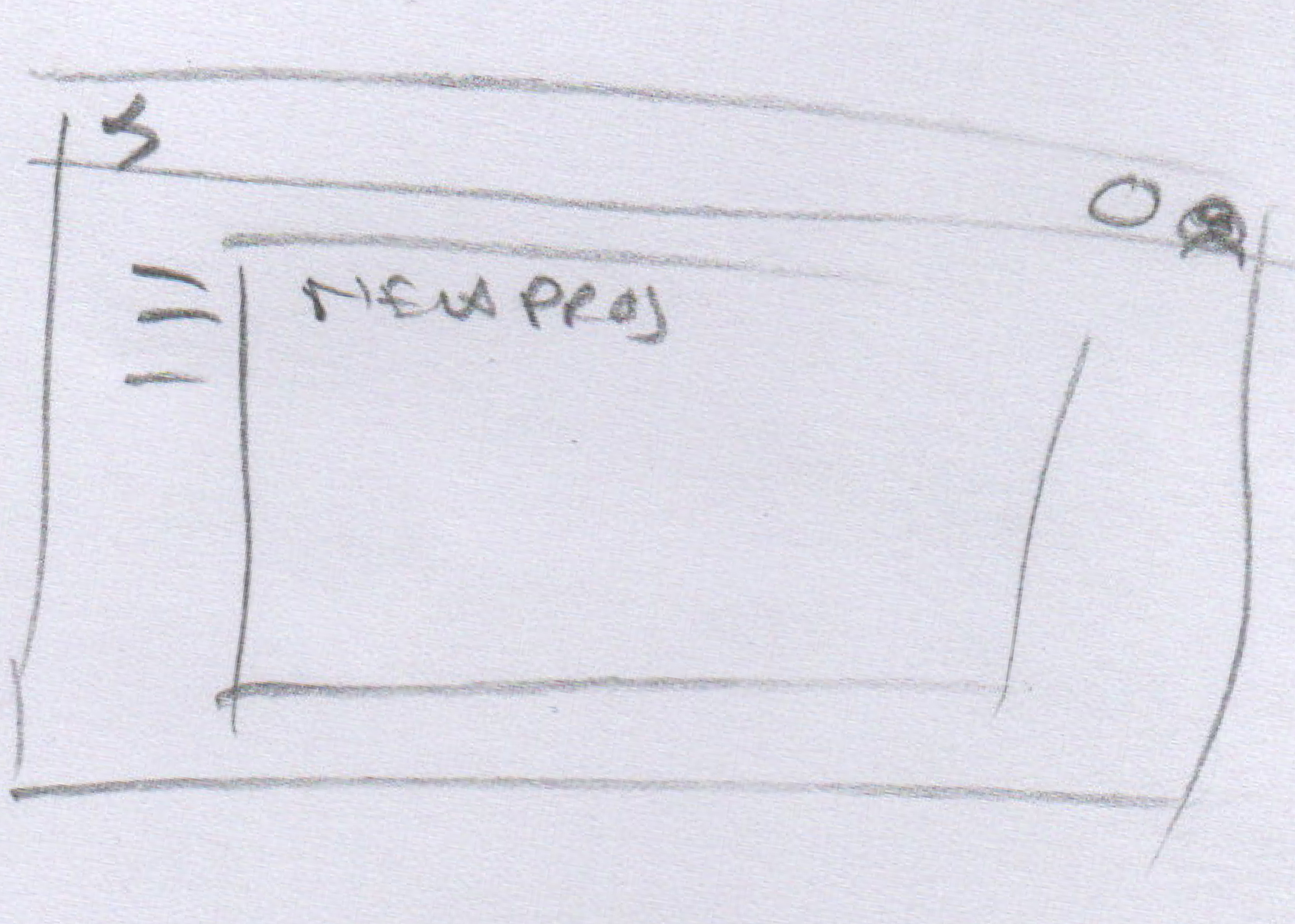
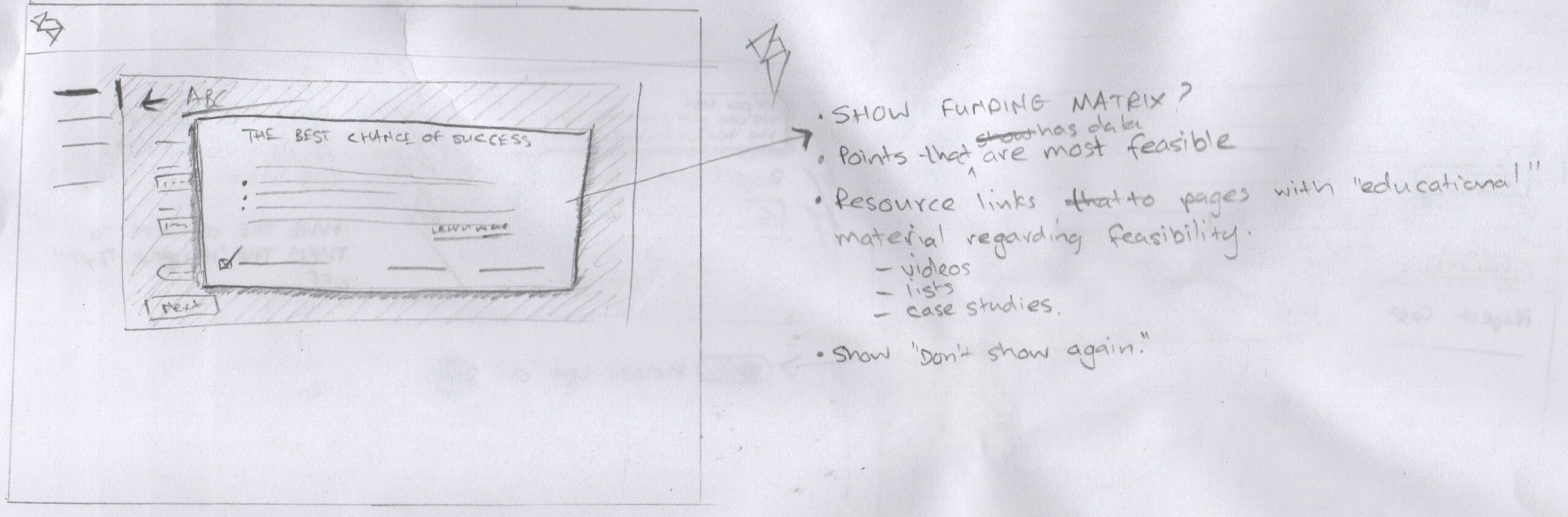
It was time to start sketching! To get an idea of how the information should be laid out, I produced a few low fidelity mockups to validate my idea of structure and visual hierarchy.
There were a few things that I had to try and solve:
- How to logically group the form inputs now that we will no longer use a wizard format
- What visual navigation format to use as I had the thought of using tabs to break up the logically sections of the proposal calculator
- Have a way to preview the proposal before a user chooses to download it
Building the IA
Now that we were longer using a progressive form to produce a proposal report, a user flow for our partners to access the tool needed to be designed.
The first iteration of the flow included the user entering into the “create new project” flow starlight away – mainly because we had not determined that a projects list was needed as we need to obtain data that partners were actually gong to use the tool.

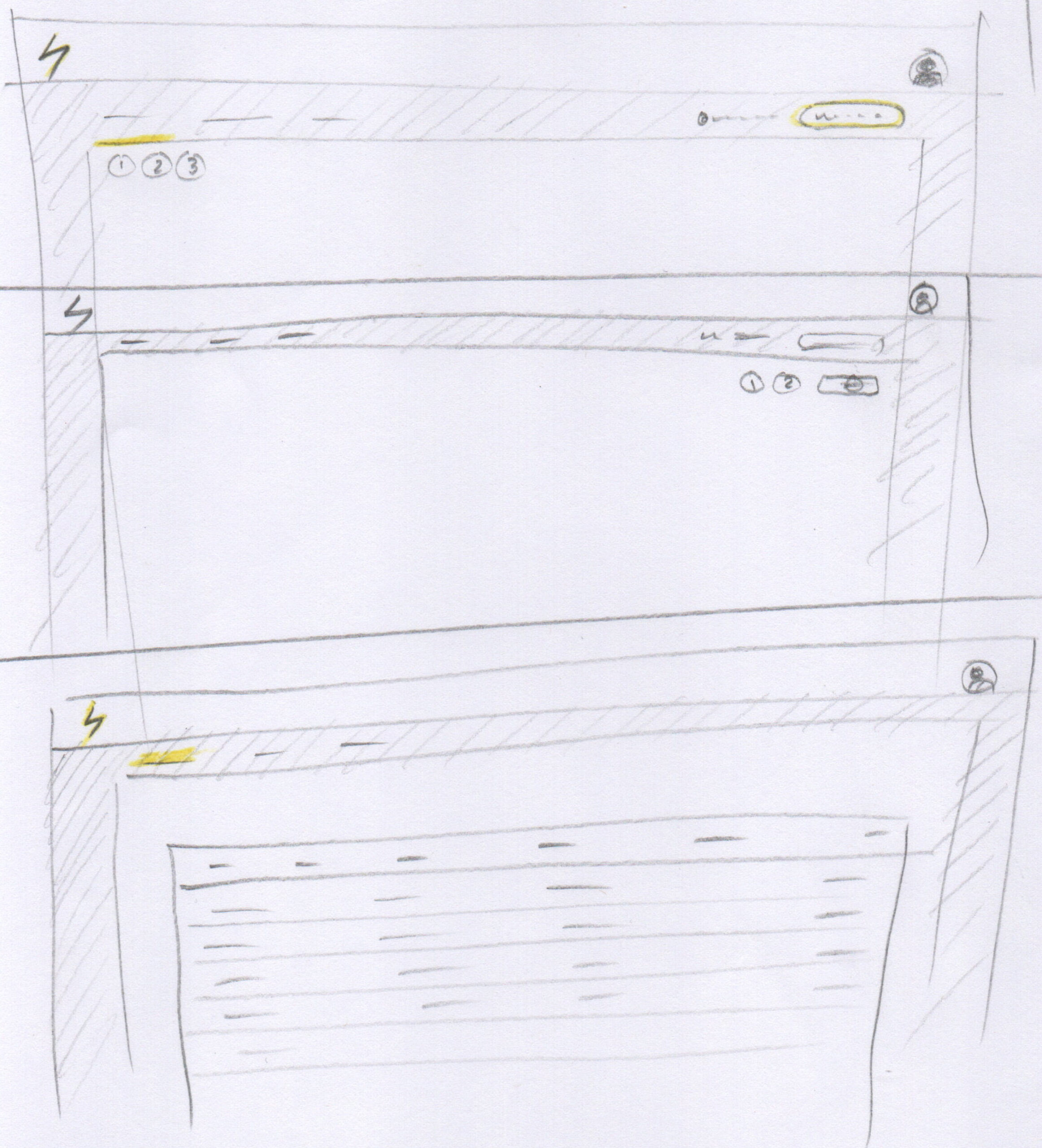
Wireframing
Based off the previous version of the wizard form, I decided to use a left-hand tab structure to group the sections. I was trying to figure what the “final” call to action needed to be and what other actions would be required that would be useful to the user.


Grouping Tabs
Logically grouping the sections into tabs proved difficult as I was replicating the wizard flow’s information architecture. This would not achieve the result of making it quick and easy to use.

Our team started to rapidly move through to development cycles to deliver to our partners, this was so that we could see if what we were building was valuable and they would use it.
Through feedback from our account executives, interviews with the partners along with analytics, we could see that they were using the tool. One of the indicators that the tool was useful was the fact that they were downloading the proposal generated through the financing calculator.
We needed to remember this and have these points when building more features and reffing the design:
- Ensure the proposal was easy to download
- Make sure the data that was entered met the criteria for a successful financing application
- Allow the partners to see a “real-time” view of the calculation results.
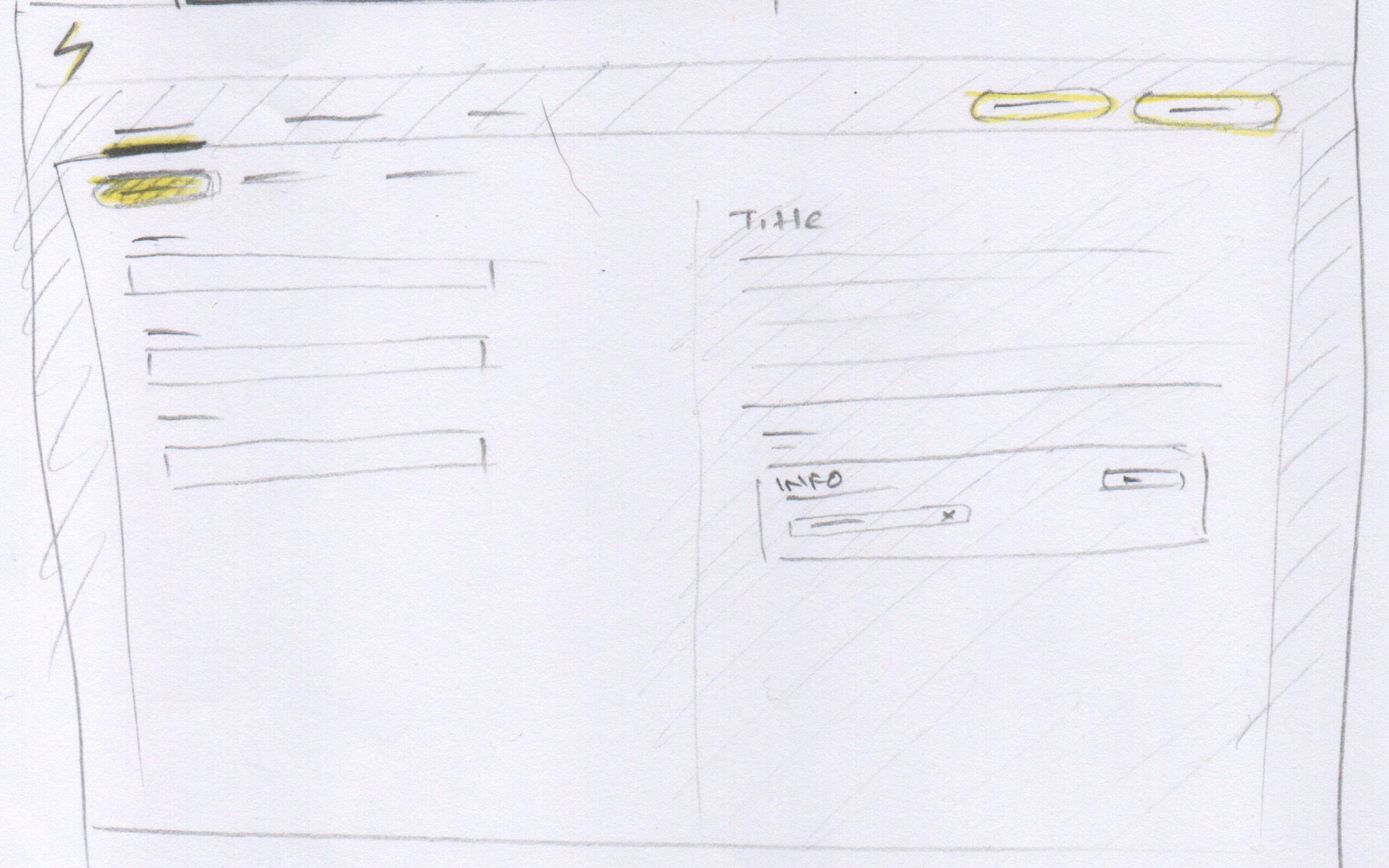
The Proposal View
The Financing Accelerator’s biggest value is the ability to show the partner the financial feasibility of a project and have the means to show this to their customers. This would be in two forms:
- The proposal preview
- The downloadable proposal collateral
One of the design tasks was to ensure that it is easy to view the calculation results. The user did not need to see all the details, but they did need to see the numbers of the savings and the possible schedule of the possible payments should the financing be successful.
Some iterations of how we tried to solve that was to have the preview of all the info appear in a column fashion, or have a summary of sorts viewable on one of the tabs:


After some thought and discussion with the product team, this was the direction we started to take; we reduced the number of tabs by grouping more form fields and keeping a summary of the results just below the four fields that persisted through all tabs:


Meanwhile…
Every product is in need of a good design system with consistent styling, components and patterns. During all the iterating and designing, I must point out that I was also building, and evolving the EnPowered Design System. Being a startup, we needed to move quickly so as you can imagine, it’s like trying to build a plane while on the runway and an many instances, in-flight!
Figma is a fantastic and powerful tool that has been an integral part of us successfully delivering quickly. It was not perfect, but without it, design would be the blocker to progress.
Alpha release
With the new design ready, the Financing Accelerator was deployed with mixPanel tracking integrated to monitor the usage. We continued to monitor usage and implement improvements where needed.
Here are designs representing the second updated version of the Financing Accelerator:


Financing Application
EnPowered works closely with installation partners to help their customers find financing. One of the big issues is gathering all the supporting documentation needed to send the application through to funders.
To alleviate the back-and-forth emails between funding-ops and the customer, which included all the files being sent as attachments, we wanted to have a place for the customer to complete an application form and upload the applicable documentation.


Updated Layout and Navigation for the Financing Accelerator
Over the period of about 6 months, the Financing Accelerator has allowed EnPowered’s partners to generate accurate financial estimates for their customer’s solar projects. We included the ability for them to share the financing application with their customers – increasing the rate at which applications could be sent to our funder network.
With the new learnings from the interactions of our partners and their clients, and the feedback received on the platform’s usability, we added features and improved the layout. The UI improvements allows the product to grow as we scale up the number of estimates and applications.


