– ux/ui designer
Design Challenge: BC Forest Fire Prediction Using Spatial Data
CHALLENGE
In 2021, I accepted a design challenge to design a small feature of a system that helps specialists in British Columbia, Canada, predict where forest fires frequently occur accompanied by how often they occur over a specified period, and Allow forecasters to easily view and interpret data of the history of forest fires.
I had a day to complete the challenge and present it to the interviewer.
PROBLEM STATEMENT
As a forest fire prediction specialist, I need to predict where forest fires frequently occur accompanied by how often they occur over a specified period, so that we can assist firefighters and national forest agencies and surround towns in preparing for annual burns that may require evacuation or fire prevention.
Functional Requirements
Allow forecasters to easily view and interpret data of the history of forest fires
quick spotting of trends of spatial data over time
IDEAS
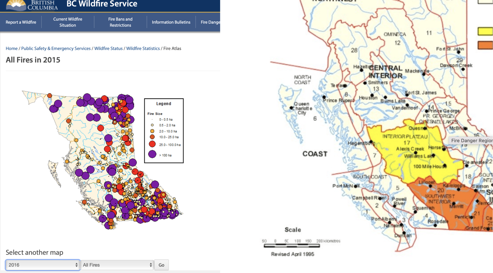
- Show trends of geographic temperatures from satellite imaging
- Pin-point geographical hotspots of frequent fire areas
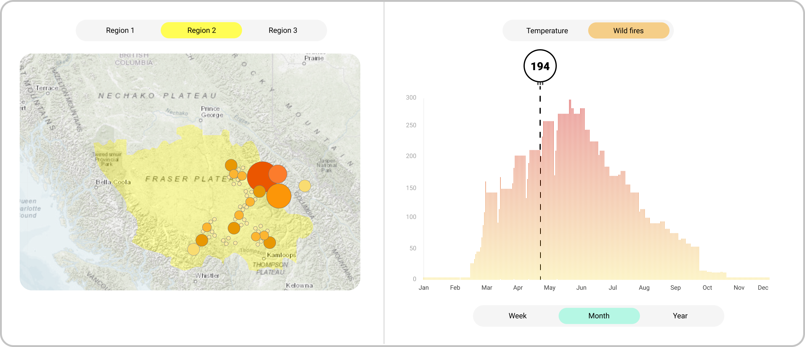
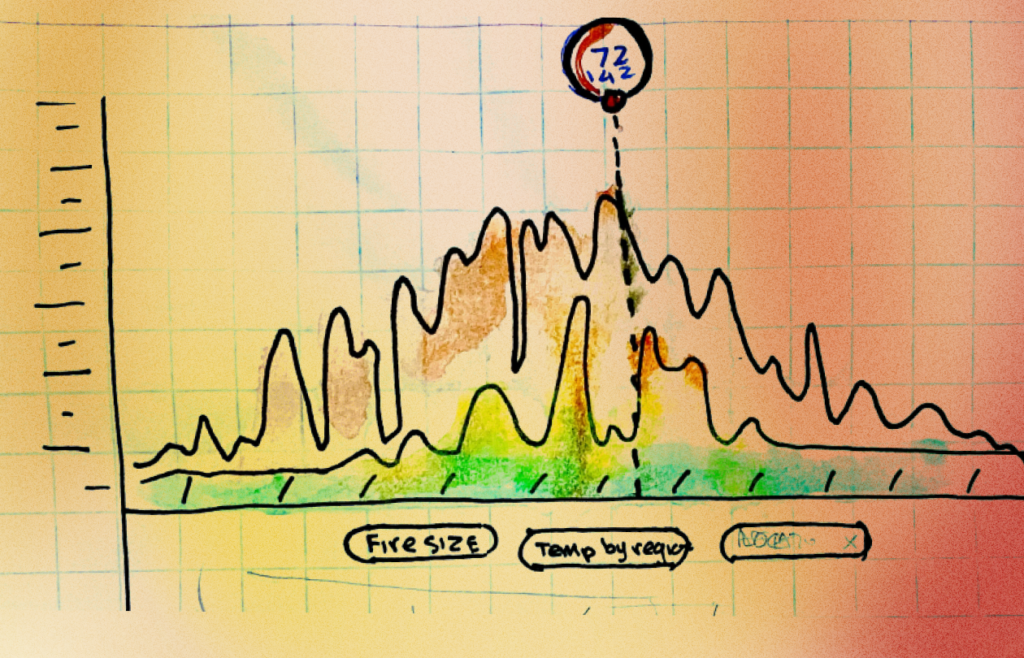
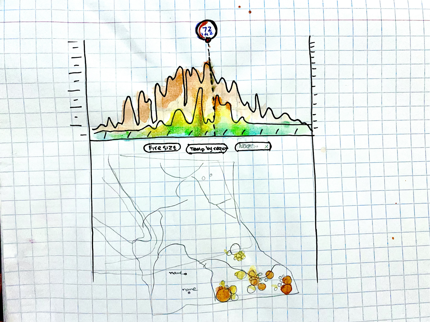
- Show a graph that displays the number fires over time overlayed by location temperatures, that when interacted with, updates forest fire locations on an adjacent map
- Toggle between wild fire location and ambient temperature, wind speed and direction

SUGGESTED SOLUTION
In formulating the solution, I was considering what the mental model of the specialist would be and whoever may be viewing the data. By presenting the data in a way that a person who looks at graphs and interactive maps may be familiar with how it should work.
- The user can select the region on the map to show the wildfires or temperature in a particular geographic area.
- The pane on the right the user can switch between Temperature or number of wild fires by week, month or year.
- When selecting a circle on the map, the data on the chart will adjust accordingly to give the specific data for that area.
Quick Sketches and Iterations
I wanted to use the colour of fire when displaying the graphs and data points – for obvious reasons. 🤓
Digital Iterations of Possible Graphs
Making graphs look beautiful is not an easy task, and making them easy to read only compounds the difficulty.


Adjacent Data Visualization
The graphs would also need to be synchronous with an adjacent interactive map that showed locations number of the wildfires in a particular region.