– ux/ui designer
Avo Auto Search Filter
Context
The world has changed, life is different, and the behaviour of people regarding how they live has changed and is changing. Nedbank decided to move into the e-commerce market in quite an ambitious way and created a “super app” called, Avo.
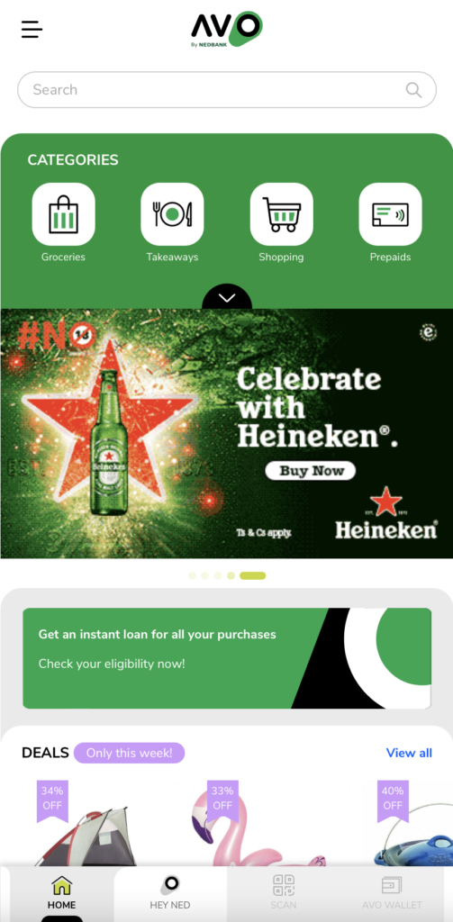
The Avo App and PWA, offers online shopping, an e-wallet, take-aways with deliveries, a concierge service as well as a personal shopper and a few other features.
Nedbank has an automotive division, the Motor Finance Corporation (MFC), which provides vehicle finance. They decided to also become a competitor in the South African online vehicle listings/sales market with a vehicle listings site where potential buyers can search for a pre-owned vehicle, interact with a dealership and apply for finance for that vehicle, all online.
Avo Auto CVP
MFC is a strong player in the vehicle finance market and thousands of vehicle dealers are approved by MFC to offer finance. The market is plagued with fraud and buyers are weary of the quality of the vehicles and of those from whom they’re buying. MFC helps facilitate safer and more efficient private vehicle sales for both buyers and sellers.
Problem
Those in South Africa looking online for pre-owned vehicles, only trust a few vehicle listing platforms in and consider them as the “go to” sites.
Avo Auto’s challenge is that they are competing with those offering pretty much the same features. In order to differentiate themselves and to compete with sites that have large and varied lists of vehicles, Avo Auto needs to emphasise their USP.
Hypothesis
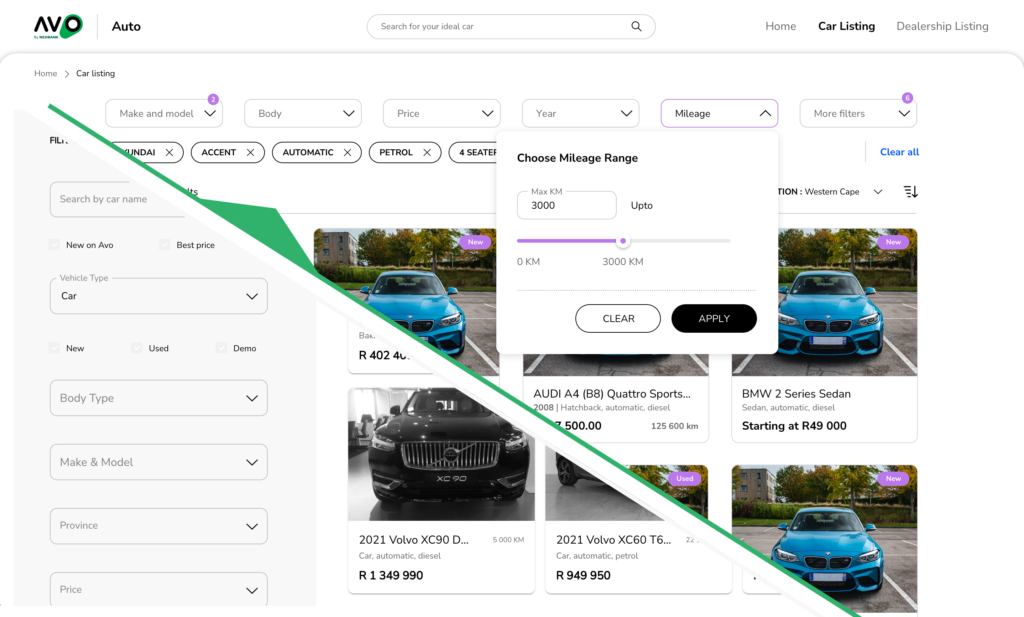
One way we think that we can compete is in the UX and UI improvement of the search and filter feature. A customer’s main activity will be sorting through a list of thousands of vehicles and Avo’s vehicle filtering experience needs to be better and more effective than their competitors.
User Testing of Existing Design
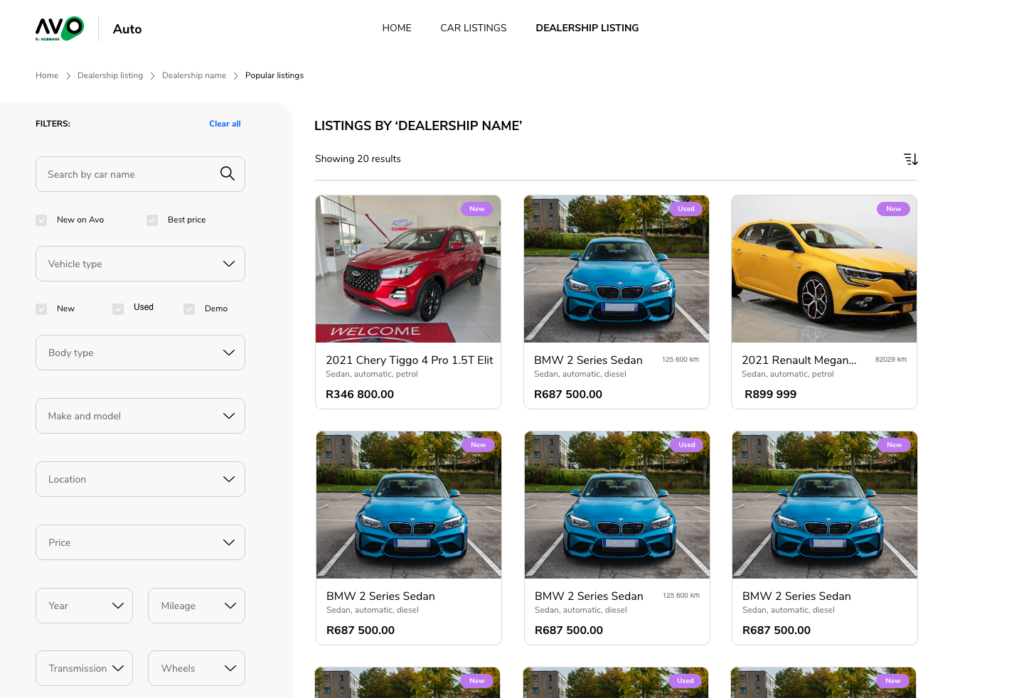
After conducting some basic heuristics and usability tests of the current filter, we discovered that having the filter to the left of the vehicle list hinders the search process as the large number of filters makes it frustrating to navigate.
Insights
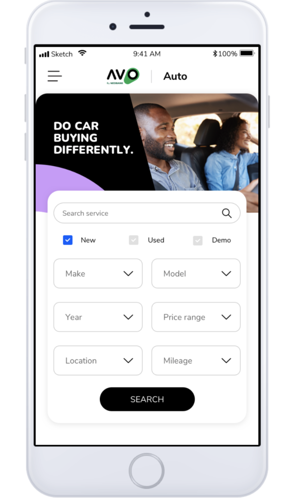
From the research we found that most customers will start an initial search for a vehicle on their mobile device but will possibly continue a more detailed search on their laptops or desktop PCs.
The use of too many drop-down lists also seemed to be quite cumbersome as the make, model and variant lists made the lists rather long which added to the difficulty of the long vertical format of the UI.
Another interesting behaviour we observed was that most only used a limited number of filters, namely: make and model, vehicle body type, price, year, and mileage. The other filters were used to narrow down after “short-listing”.
A few even asked if there was a compare function so that they could compare some of their choices. Most customers usually have an idea of the type of vehicle they want, and even the brand and price range; this is usually the case because they have been searching on other sites.
Competitor Analysis
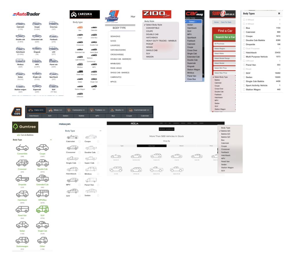
I conducted some desktop research to understand how Avo’s competitors have designed their search and filter feature. It seemed that most favoured having the filter on the left and utilised a lot of lists. A lot of the filters seemed quite confusing and frustrating to me (my own assessment) and each seemed to be a slight variation of the other.
There were some that had some helpful features such as showing illustrations of the body types and UI “chips” to help you know what filter you have selected.
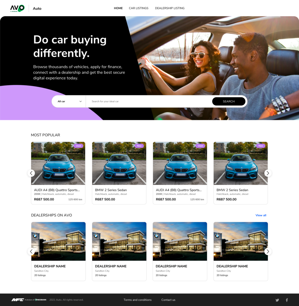
I also looked at the international market and what features and layouts vehicle listings were using. I found that some of the more popular sites used a horizontal layout for the vehicle filter and pinned it to the top of the page when scrolling through the vehicle list which allows the person to update the filter and still have a clear view of the vehicle list.
Solution and Prototype
We iterated the design concept a few times trying to keep in mind the space in which the filters lie as well as to ensure that we do not create cognitive load for the person using the filter.
Regardless of the limitations of the InVision prototype in order to test the full functionality of the search filter, the test participants responded well to the new design and preferred the horizontal layout over the left-hand filter.


Refining the design


Summary
An update to the Avo design system is in process and will affect the way the new filter looks as well as the small interactions, however the usability of the feature will be monitored and we will know that the new design will be helping to fulfil the purpose of helping people find the vehicle they want and even to increase conversions of more people applying for vehicle finance.